


Background
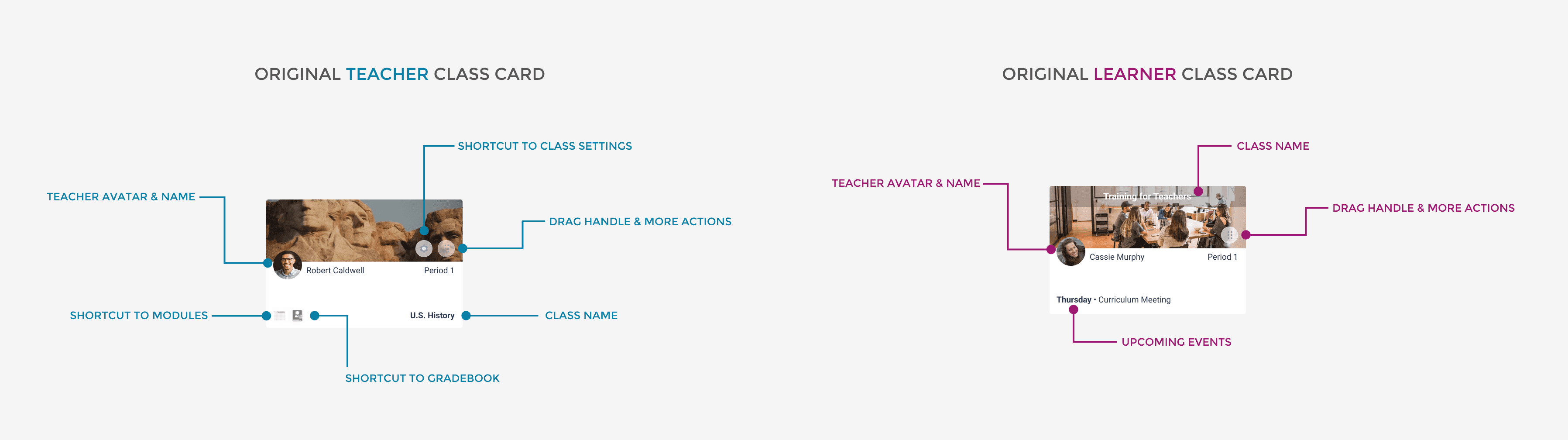
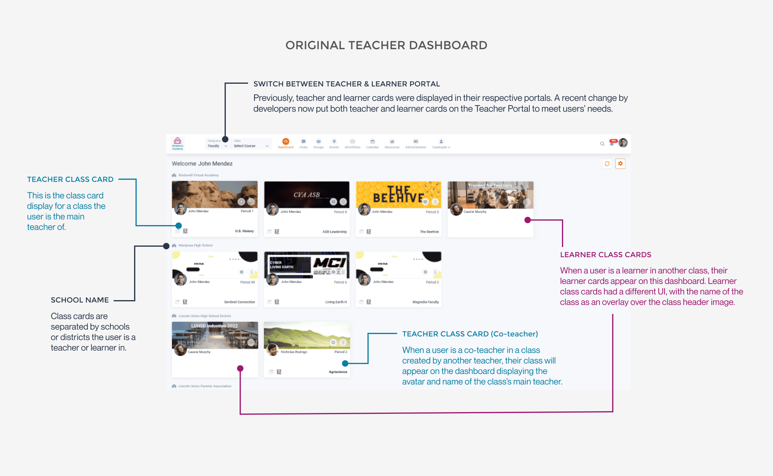
This project originated from a customer service ticket prompted by a recent development change. The modification introduced both teacher class cards (representing classes taught by the user) and learner class cards (reflecting classes they are students in or co-teach) to the teacher dashboard of our learning management system. Below is the anatomy of our original class cards and teacher dashboard.
This adjustment aimed to address user feedback, as they expressed a preference for having both teacher and learner cards visible on a single dashboard rather than toggling between learner and teacher dashboards. However, additional challenges were identified through further user complaints:

Main Problem & Empathy
There is little visual distinction between teacher and learner class cards.
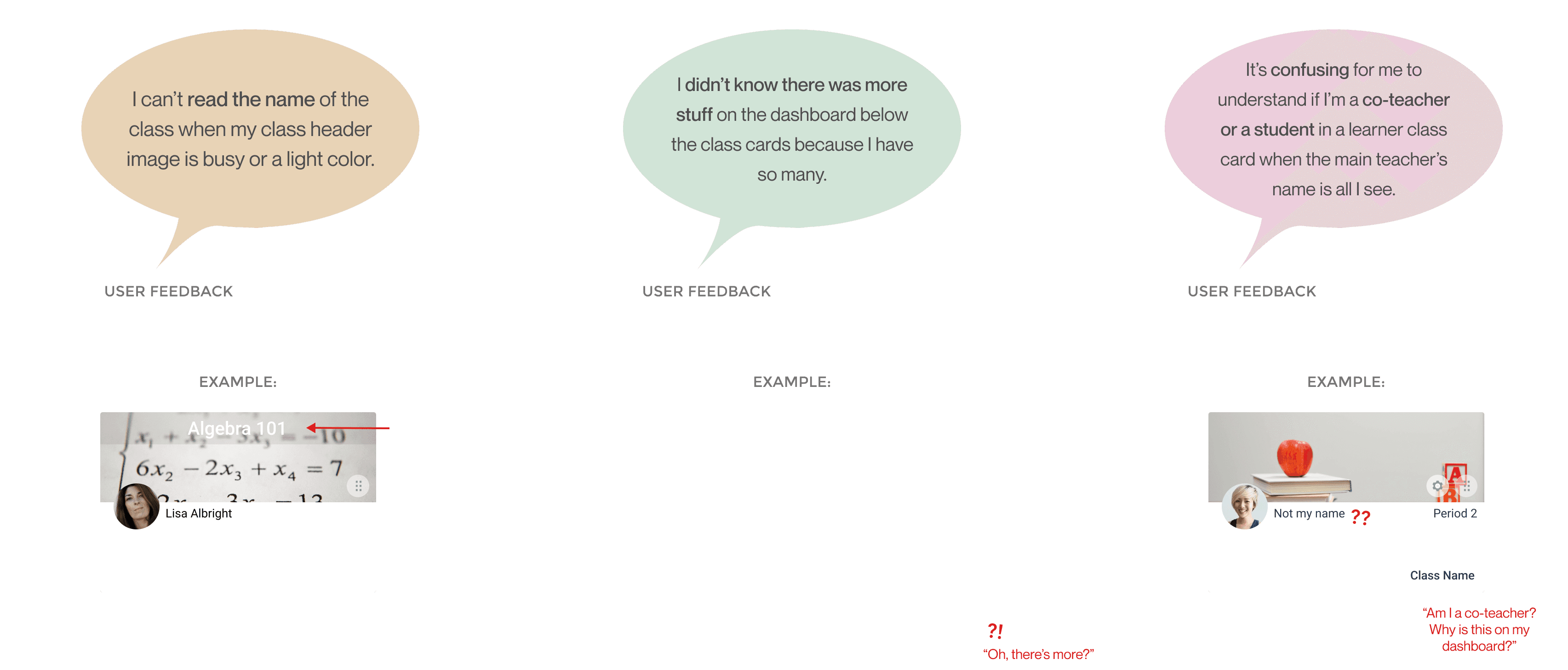
With the new merging of both teacher and learner cards on the Teacher Dashboard, users were suddenly overwhelmed with class cards when they first opened up their dashboard, especially teachers who taught in multiple schools or were learners in classes themselves. With the only visual distinction between their teacher and learner cards being that the learner cards had a gray overlay on the class header image, teachers ran into several visibility issues on these cards. After understanding users through notes from our customer service team, a few of their complaints on the new UI were as follows:
Discovery & UX Audit
Uncovering other usability flaws and advocating for a full redesign.
While the visual error was a noticeable disruption to users, a deeper analysis revealed critical design flaws in the current class card that significantly impacted the user experience. Applying Nielsen’s 10 Usability Heuristics, I discerned several issues undermining the overall quality of both teacher and student dashboards.
Rapid Research
I conducted rapid research in order to structure my design within time constraints. To address the diverse interface issues, I initiated a comprehensive exploration of standard card designs within learning management systems. I did this by conducting competitive analysis on the structure of class cards and their features of our competitors, such as Google Classroom and Canvas. I also conducted extensive research in Nielsen Norman Group's principles for Drag & Drop elements to help understand how to communicate the interactions of these cards intuitively. User research was conducted through notes and user feedback from our customer development team to understand user pain points. The collection of these insights helped to refine and template my final solutions.
Adaptive Design
Establishing Class Card Rules
After understanding standard card design for learning management systems and evaluating card features pertinent to our product, I devised a flexible design strategy to ensure the user interface's effectiveness and visual appeal across our systems's unique situations and issues.
This approach aimed to deliver a seamless and optimized experience for users in various states and contexts, encompassing considerations for:
Co-teacher display rules
Rules for several periods (aka linked periods)
Long name display
Ideation & Iterations
There were 4 iterations of the class card display. Their differences in addressing our card design's issues and and the addition of newer features following weekly design meetings with team leads are annotated below.
Final Design
After much deliberation, the consensus after this design was to separate the teacher and learner cards back into their respective dashboards to eliminate redundancy (the original design had both teacher and learner cards visible on the Teacher Dashboard, while when the user toggled back to the Learner Dashboard, only learner cards would be visible). In the final Dashboard redesign, users are able to collapse cards pertaining to a specific school when the teacher is apart of multiple schools.
The final designs are below:
